I have to admit, I procrastinated this column quite a bit this year. It has become a favorite staple for me, and, I'm happy to see, for our readers. But something was holding me back from pulling the trigger on getting the list together this time around.
It's a lot of work, of course. So I'm sure that played into it. Who isn't lazy every now and then? But part of it, I came to discover, was that there wasn't a lot of memorable work behind the camera this year. By that I mean, while there was plenty of quality photography, single images that demanded a spot on a list like this were difficult to come by. Boiling things down to a specific collective was difficult as a result, so it took a little time.
But I'm frankly realizing just now that I've written this intro before. I'm spoiled by this column's inaugural year (2007), where it seemed easy to come up with a set of 10 images and then some. The lack of singular imagery was so considerable this time around that I'm unable, even, to come up with a brief list of also rans, which is something I generally like to do.
Nevertheless, it should be said that great cinematography isn't (and shouldn't be) dependent on singular frames or visual moments, but the overall canvas and mise-en-scene delivered from beginning to end. I have a lot of fun digging into the visual vocabulary of a year in film and, to say the least, discussing that vocabulary with the craftsmen and women involved, so who can complain? I hope you enjoy.
#10
"THE SECRET IN THEIR EYES"
Director of Photography: Félix Monti
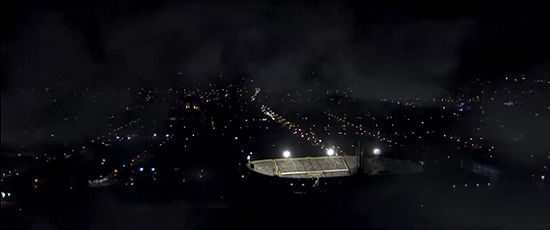
This sequence dramatically breaks the story in two: before and after finding the murderer. [Director Juan José] Campanella had this sequence in mind from the beginning when he was writing the script. He felt the need to tell this particular moment in a different way, using time and rhythm as an element to play in the whole story. All in all there were nine different camera positions.
–Félix Monti
One of the shots that I immediately knew would at least be considered for this list I saw at the tail end of last year's Oscar season. The Best Foreign Language Film winner "The Secret in Their Eyes" was actually, I think, the last of 2009′s nominees that I caught, but it didn't see a U.S. release until 2010, so it was eligible for consideration here this time around.
The shot is a daring, even somewhat out of place fluid master, beginning with the frame you see above, sweeping across a soccer match and into the stands to catch up with our investigator heroes. The camera then, with plenty of effects and editorial help, stays with them as they pursue a criminal through the crowd, into the lower reaches of the stadium and finally, out onto the field itself.
Sometimes the sheer audacity of a shot is enough for me to give it a shout out here, particularly when it's pulled off this well. It may not have been the most thematically relevant take of the film, but it certainly got my heart racing for a solid five minutes.
#9
"THE KING'S SPEECH"
Director of Photography: Danny Cohen
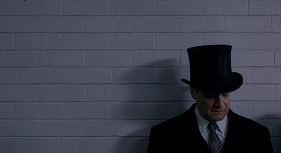
Where we put him in the shot, it's like, here is a man who is cornered. There was a way of putting Colin [Firth] in the frame and giving him lots of head room and short-sighting him that really gives you that sense that things are uncomfortable. There's not a lot of light going into his eyes. There are deep shadows and all of that kind of builds the tension that it's not going to be an easy journey. And it breaks up the pacing. There's no chaos if there isn't any calm before the storm.
–Danny Cohen
The visual characteristics of Tom Hooper's "The King's Speech" have been a source of ridicule for some, but when I saw the film at Telluride back in September, I was immediately appreciative of its aesthetic and thematic virtues behind the camera. And cinematographer Danny Cohen puts it rather succinctly in the quote above.
The shot that first stood out for me in the film and indicated this purposeful thematic framing came in the first few minutes, as Prince Albert, Duke of York (not yet a king) prepares to deliver an address at the British Empire Exhibition in 1925. He is, as noted above, "a man cornered," and there is clearly an anxiety revealed around the character that will come to define him throughout.
Again, some may find this aesthetic clumsy or often misused, and sure, there are instances of this. But this image wasn't one of them, I felt. It laid the groundwork well and with simplistic ease.
#8
"SHUTTER ISLAND"
Director of Photography: Robert Richardson
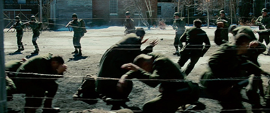
That was entirely developed out of Marty's mind. He wanted one sustained take. Once the initial shot was fired and all the soldiers began firing, his idea was, 'Let's maintain it. I don't want to break.' It was a dolly shot, a hundred some-odd feet, maybe close to 200. And a great deal of the blood was CG blood because of the number of shots fired. We shot it outside of Boston in a small town. It was I believe a mill at one point that Dante Ferretti transformed it into what you saw.
–Robert Richardson
It was really a shame that "Shutter Island" didn't fare well with the Academy this year, and particularly that Robert Richardson's typically expert lensing was ignored completely throughout the year. But he and director Martin Scorsese nevertheless found a striking way to tell the story of a man trapped in his own fantasy, one that is, in this viewer's opinion, misunderstood to this day.
The film is full of vibrant images. And much of the visual journey is impacted more significantly by Thelma Schoonmaker's editing, but when it came to deciding upon an image (as I knew one would have to be considered for this column), I couldn't help but remember how rocked I was by the extended dolly of American soldiers taking ruthless vengeance by executing equally ruthless Nazis, part of the main character's many flashbacks.
The shot is affecting because of that extension. After the initial shock of the moment wears off, the dolly keeps moving, allowing the horror to settle in again, and more deeply. The film marked Richardson's fifth collaboration with Scorsese to date. Here's to many more.
#7
"THE GHOST WRITER"
Director of Photography: Pawel Edelman
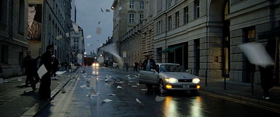
In the original script there was no such ending. From the very beginning we were thinking of how to end this film, how to find this image that would just close the whole story. It was Roman's idea, two weeks before we were supposed to shoot that scene. We wanted an evening, magic hour shot, mysterious and dark. And we didn't want to show, we wanted to suggest that something dramatic may have happened. We took two or three takes and the last take was the best.
–Pawel Edelman
I wasn't the biggest fan of Roman Polanski's "The Ghost Writer" this year, but I was, as I imagine many were, quite taken by its final image. The filmmaker collaborated once again with cinematographer Pawel Edelman on the film. If you haven't seen it, perhaps it's best to duck out after this paragraph, lest you be spoiled.
The final moment comes after Ewan McGregor's nameless title character ill-advisedly reveals the twisted truth he has discovered of the former British Prime Minister's death. He makes his way out into the streets of London (shot in Berlin) and meets, we think, a deadly fate, the story of which is told by countless pages of his tell-all, ghost-written manuscript flying into the shot one by one before ultimately filling the frame.
Images like this are simple but effective, and they reveal artists looking for unique ways to convey a story visually. That is, after all, the trademark of the greatest directors (and great cinematography), and Polanski found himself in their league long ago.
#6
"CAIRO TIME"
Director of Photography: Luc Montpellier
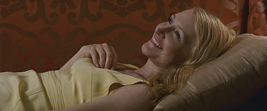
This was a true dance between Patricia, the camera, the design and her wardrobe just to try to communicate in every frame that there's an evolution there. It's almost like she's 15 again and she realizes she's alive again. We did numerous takes, just to get her hand positions right and her expression. It was very closely choreographed. Any time we can make the audience feel the way she does, and it doesn't always have to be with the big vistas, that's the success of the film, in a way.
–Luc Montpellier
One of the most underrated films of the year when it comes to cinematography was Ruba Nadda's "Cairo Time." The same could actually be said of its exquisite score, but Luc Montpellier's sun-kissed photography was kind of a show-stopper for me. There are a number of frames that are captivating, both in composition and in visually telling the story.
The image that leapt off the screen at me, however, was the simple frame above of Patricia Clarkson's Juliette Grant, after spending a wonderful day with her local escort, Tareq (played by Alexander Siddig), waiting to spend time with her UN official husband. We see the beginnings of an unexpected emotional affair (just moments after a stolen kiss) unfold crisply and powerfully in a glamorous composition.
I really don't think I could say it any better than Montpellier does above. And it's nice to know it was less a happy accident than a rigorously detailed shot that was very aware of its thematic virtues. I could have selected any number of shots from this film, though. It was a personal favorite in that regard.
As I mentioned yesterday, it wasn't exactly a banner year for singular images from films in 2010. And that's certainly not a crime. But more to the point, what I learned as I set about writing this piece was how deeply my personal experience of the year was reflected in my ultimate selections. It may have been tough to find what felt right for the list, but in some ways, the intensity of that digging ultimately illuminated the year's work for me all the more.
How can I not be grateful for that? In the final analysis, perhaps a year that isn't so obvious, without such a bevy of possibilities for this collective, yields a more measured and perhaps passionate consideration of the year in visual storytelling. Not to be highfalutin. Anyway, I hope you enjoy the conclusion. Let's dive in…
#5
"BLACK SWAN"
Director of Photography: Matthew Libatique
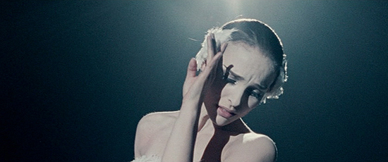
We ended up waiting to do that scene because we were going back and forth on what kind of presentation it was going to be. We talked about doing it on stage or some kind of abstract set, but I opted for spotlights and the black void. Simpler was better, though the camera rotated probably eight times, possibly more. Karma, I think, helped it out because we shot it in the same space they shot the death scene in 'All That Jazz,' which is one of my favorite films.
–Matthew Libatique
Darren Aronofsky's "Black Swan," like all of his works, is, in so many words, a masterfully shot film. He teamed up with lenser Matthew Libatique again after a one-film departure and the work behind the camera is some of the most potent of the year. And choosing one shot was tough.
There are plenty of compositions that are thematically relevant but fail to, I think, capture the essence of what makes the photography so special. I ultimately decided that the third shot of the film, which begins on Von Rothbart during a heightened, trance-like "Swan Lake" number and follows to capture his ballet duet with Natalie Portman's Nina Sayers (and, to be clear, does include one "hidden" cut) establishes the language of the "oppressive" camera, as Libatique puts it, and that feather-like grace it maintains throughout.
Moreover, and granted, it comes early, but I think it is also the moment when it really registers for the audience that this will be a unique cinematic experience, if nothing else. And was it ever.
#4
"TRUE GRIT"
Director of Photograph: Roger Deakins
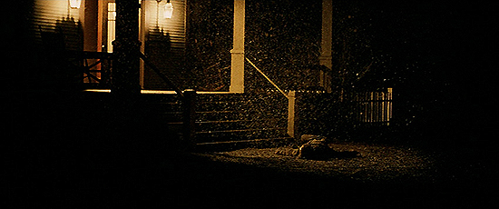
We storyboarded a few shots, tracking and looking down the street at dawn, which we actually did. But in the middle of the night, when we couldn't do much else and were waiting to set up the dawn shot, we decided to do this side track-in. It's kind of lovely the way the horse just whips through frame and then is gone and the snow sort of shifts around him. And that's the one they used, I think because it's so pure and simple. That was the whole thing about the film, really. It's not fussy.
–Roger Deakins
No list such as this would be complete without serious consideration of a true modern master of the form, Roger Deakins. He just missed last year, but this year his work in the Coen brothers' "True Grit" yielded one particular image that stood out from the get-go. Indeed, it's the film's first image (and much has been written of it since I spoke with him about it in December).
In so many ways it tells a story, with style and narrative power, helped by the exposition of narration, sure, but the simplicity (as noted in the quote above) is what makes it such a perfect composition. And in a film that, for me, lacked embossed visual power (mostly by design), I relished this particular frame.
And now Deakins is set to leave film behind, likely forever. He's really turned on by what he's up to on Andrew Niccol's "Now" and he's very happy with the kinds of tools at his disposal both there and in animation. If indeed he's leaving celluloid behind, it's been a hell of a ride. And I'm sure he'll continue to dazzle on digital.
#3
"I AM LOVE"
Director of Photography: Yorick Le Saux
We wanted the feel to be rich and majestic but not luxe. We didn't want something that would look like a commercial, with too much light, too much brilliance…Luca [Guadagnino] is probably the most technical director I've worked with. He knows everything about cameras and lenses. I think he can tell you every special speed that Christopher Doyle used on a Wong Kar-wai movie in the Nineties!
–Yorick Le Saux (from American Cinematographer Magazine)*
I wasn't particularly high on Luca Guadagnino's "I Am Love" this year, but I certainly appreciated it for its design and photography. It's actually a film full of vibrant images, but one stuck out above all the others.
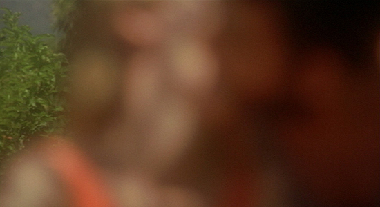
After a day of obsessively stalking the object of her affection, Emma Recchi (played by Tilda Swinton) finally falls into the rabbit hole of forbidden love in a brief, clipped, stolen kiss filmed entirely out of focus. For some, it's an arbitrary decision. But for me, it's perhaps the most truthful visual depiction of the intoxication that comes with a moment like that, the guilt, the excitement and the passion swirling in the same glorious mixture.
Any number of the film's wonderful images, captured by D.P. Yorick Le Saux, could have been tapped for this collective. But this one, I thought, was the most meaningful of the bunch, the most emotionally and thematically authentic, and above all, the most surprising.
#2
"ENTER THE VOID"
Director of Photography: Benoît Debie
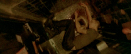
One of Gaspar's great qualities is that he pushes you to experiment…If, for whatever reason, something doesn't work out as he hoped, he will never reproach you. He tells you, 'Let's try it, and if it's not good, tomorrow we'll do something else.' That allows you to take a lot of risks. He is searching, and he therefore pushes others to do the same.
–Benoît Debie, (from American Cinematographer Magazine)*
My pick for the year's best cinematography was Benoît Debie's work on Gaspar Noé's "Enter the Void," but narrowing a selection down for a piece such as this felt nearly impossible. The instinct is to say, "the whole film," because it is another example of Noé's penchant for flowing consistency with the camera, rather than intense editing.
However, the one shot that sticks out and really announces a unique visual vocabulary for the piece, unique even for Noé, comes during the first act break when the soul of lead character Oscar is sent on the journey the audience will observe for the next two hours. The camera floats up to a single naked light bulb, caught in the visual aroma of its illumination for a few hypnotic moments before turning back to the fallen Oscar, whatever force is behind it finally aware of its new place in the universe.
This kind of boundary-pushing, whether you love the film or hate it, is what is vital for the continued evolution of cinema. For some it might ring as gimmicky, but for me it is a true hallmark of expanding how we perceive this medium.
#1
"INCEPTION"
Director of Photography: Wally Pfister
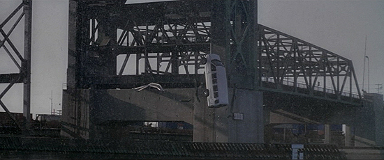
Obviously it's a very key storytelling thread. It acts as this ticking clock, an hourglass, and we knew the weight of the shot for our movie. Chris [Nolan] wanted to get the camera as slow as we possibly could, and it really is our general philosophy on everything we're doing on these films is to try and get it in camera. We went down to San Pedro and it seemed like a perfect place. It was just enough of a drop, they allowed us to do it and it sort of fit in with our shoot-up leading up to it.
–Wally Pfister
Sometimes a year-topping shot for me is all about identity, like last year's pick, which came to define as a visual reference point. Sometimes it's well-achieved complexity, like 2008′s winner. Other times it's simple striking beauty and iconography, like 2007′s winner.
This year, it was about implementation and, admittedly, a consideration partly owed to film editing. But the image from "Inception" of a van falling in slow-motion served, as Wally Pfister notes above, as a brilliant timing mechanism for a film entirely built upon its chronology, both narratively and, in some ways, thematically.
I admit to cheating somewhat, as it's not just the take above that director Christopher Nolan and editor Lee Smith continuously cut to throughout the film's third act, but a couple of angles. (The drop was executed twice and multiple cameras were staged all around for multiple options.) Nevertheless, no image meant as much when it flashed on the screen this year, and for that reason alone, it seemed the best choice for me as shot of the year.
The top 10 shots of 2010
No comments:
Post a Comment