Monday, February 28, 2011

Oscar Statistics: Money, Men, and Maturity; Plus Our Predictions | William M. Briggs, Statistician

Which is the better movie, the one awarded an Oscar for Best Picture or the Most Popular, defined as the one with that year's highest box office gross? The former is, ostensibly, chosen by experts, the latter picked by you.

We cannot answer that question, but we can discover some of the differences between Best and Most Popular pictures.

  • The Most Popular picture routinely made about twice what the Best Picture took in, and there is good evidence this trend is increasing.
  • Many pictures had only men in the lead and no women.
  • Women over 40 are rare, and over 50 virtually non-existent, while older men show up increasingly frequently.
  • Best Pictures usually had older actors and actresses than the Most Popular movies.
  • There were fewer comedies for Oscars, more Action & Adventure for Most Popular flicks.

The Oscars for Best Picture were awarded from 1927/1928 until 2009; 83 years so far. In 1928, there was no Best Picture award, but one called Most Outstanding Production, which was given to a film that ran over 1927 and 1928 (Wings). We included this in the Best Picture category for 1927.

Sixteen of the 83 years, or 19%, found the Best Picture also being the Most Popular. These were movies like The Broadway Melody, It Happened One Night, Gone with the Wind, The Sound of Music, and The Godfather.

Full article:
William M. Briggs, Statistician » Oscar Statistics: Money, Men, and Maturity; Plus Our Predictions


Sunday, February 27, 2011

Amazing Hitchcock discovery | Scott Myers

Amazing Hitchcock discovery

This is pretty amazing. Via FilmDetail:
In 1962 François Truffaut carried out a series of extensive interviews with Alfred Hitchcock at his offices in Universal Studios.

They were recorded to audio tape and the content eventually edited down into Truffaut's famous book Hitchcock: A Definitive Study of Alfred Hitchcock.

The half hour sessions were subsequently broadcast on French radio and in 2006 Tom Sutpen started posting audio files of the sessions on his blog 'If Charlie Parker Was a Gunslinger, There'd Be a Whole Lot of Dead Copycats'.
And here are the links:
  • Part 1: Childhood through to his early years in the film industry [MP3]
  • Part 2: Mountain Eagle through to the end of the silent era [MP3]
  • Part 3: Blackmail through to a discussion about American audiences [MP3]
  • Part 4: Rich and Strange through to realism in films [MP3]
  • Part 5: The 39 Steps through to plausibility in film and film critics [MP3]
  • Part 6: Secret Agent and Sabotage [MP3]
  • Part 7: Young and Innocent and The Lady Vanishes [MP3]
  • Part 8: Final years in Britain through to his move to America [MP3]
  • Part 9: Rebecca [MP3]
  • Part 10: Discussion about Hollywood through to Notorious [MP3]
  • Part 11: Mr and Mrs Smith through to Suspicion [MP3]
  • Part 12: Saboteur through to Shadow of a Doubt [MP3]
  • Part 13: Lifeboat through to Spellbound [MP3]
  • Part 14: Notorious through to The Paradine Case [MP3]
  • Part 15: Rope [MP3]
  • Part 16: Rope and Under Capricorn [MP3]
  • Part 17: Stage Fright through to Strangers on a Train [MP3]
  • Part 18: Strangers on a Train through to I Confess [MP3]
  • Part 19: Notorious through to a discussion about suspense [MP3]
  • Part 20: Initial discussion about the The Birds through to Rear Window [MP3]
  • Part 21: The Wrong Man through to Vertigo [MP3]
  • Part 22: North by Northwest through to Psycho [MP3]
  • Part 23: Psycho [MP3]
  • Part 24: The Birds [MP3]
  • Part 25: Psycho through to characterisation in films [MP3]
There you go, Hitchcock fans. Go to town!


Go Into The Story: Amazing Hitchcock discovery


- Sent using Google Toolbar

Overused Words | Scott Myers

Overused Words

Writer and blogger Bish Denham came up with a helpful post:
In revising and editing much is said about over used words or words to avoid. In my struggle to revise I realized I wanted/needed a list. In fact, I thought I had one, but I couldn't find it. I scoured the Internet and asked Angela at The Bookshelf Muse if she knew of a list. Even she had trouble finding anything complete.

Well...after quite a search I have compiled the following list. It is for the use of any writer who needs it. Copy it, if you want. I'm going to dedicate a "page" to it. If you have any additions please email me and I'll add them.
Here is the list from A-E:

a lot
absolutely
actually
all
almost
although
always
amazing
and
anxiously
any
as (particularly starting a sentence)
awesome
awfully
bad
beautiful
because
be
been
being
began
begin
believe
better
big
boring
bring
but (contrasting)
by
cause
certain
change
chiefly
choose
could
could have
crossed
decent
definitely
eagerly
easy/easily
effective
emphasize
end
energy
enjoy
entire
especially
even
every
excellent
exciting

You can see the rest of the list of overused words here. There are two that make my skin crawl: look and walk. They are such flaccid verbs and in my view are the main reason why God invented the thesaurus (S/He did, didn't S/He?).

Instead of look: eye, ogle, glare, squint, leer, gaze, peep, scan, rubberneck, glance...

Instead of walk: amble, shuffle, hustle, trip, leap, sprint, cavort, stumble, tiptoe, plod...

Words are our friends! Use them and use them well!

What other overused words would you add to Bish's list?


Scott said...

Further explanation about "look" and "walk." Sometimes they are the appropriate word. However after years of reading scripts where writers use those two words over and over and over and over again in their scripts -- as if those are the two default words for the act of eying something or physical movement -- I have pretty much gotten annoyed by them.

To me, they cut against the grain of what I call imagematic writing which is where a writer uses strong verbs and vivid descriptors to convey a sense of what's happening in the moment.

Remember: Script readers hate scene description. Why? Because it slows down their reading process. Therefore as screenwriters, we must do whatever we can to make our scene description as engaging and entertaining as possible. Even simple word choices -- verbs and descriptors -- can make a difference.

So if you'll excuse me, I have to walk... er... lumber away from this thread to look at... um... peruse some more comments.


Go Into The Story: Overused Words

Link to original post:
Random Thoughts: Over Used Words | Bish Denham

Friday, February 25, 2011

The top 10 shots of 2010 | Kristopher Tapley

I have to admit, I procrastinated this column quite a bit this year. It has become a favorite staple for me, and, I'm happy to see, for our readers. But something was holding me back from pulling the trigger on getting the list together this time around.

It's a lot of work, of course. So I'm sure that played into it. Who isn't lazy every now and then? But part of it, I came to discover, was that there wasn't a lot of memorable work behind the camera this year. By that I mean, while there was plenty of quality photography, single images that demanded a spot on a list like this were difficult to come by. Boiling things down to a specific collective was difficult as a result, so it took a little time.

But I'm frankly realizing just now that I've written this intro before. I'm spoiled by this column's inaugural year (2007), where it seemed easy to come up with a set of 10 images and then some. The lack of singular imagery was so considerable this time around that I'm unable, even, to come up with a brief list of also rans, which is something I generally like to do.

Nevertheless, it should be said that great cinematography isn't (and shouldn't be) dependent on singular frames or visual moments, but the overall canvas and mise-en-scene delivered from beginning to end. I have a lot of fun digging into the visual vocabulary of a year in film and, to say the least, discussing that vocabulary with the craftsmen and women involved, so who can complain? I hope you enjoy.

#10

"THE SECRET IN THEIR EYES"
Director of Photography: Félix Monti

This sequence dramatically breaks the story in two: before and after finding the murderer. [Director Juan José] Campanella had this sequence in mind from the beginning when he was writing the script. He felt the need to tell this particular moment in a different way, using time and rhythm as an element to play in the whole story. All in all there were nine different camera positions.

–Félix Monti

One of the shots that I immediately knew would at least be considered for this list I saw at the tail end of last year's Oscar season. The Best Foreign Language Film winner "The Secret in Their Eyes" was actually, I think, the last of 2009′s nominees that I caught, but it didn't see a U.S. release until 2010, so it was eligible for consideration here this time around.

The shot is a daring, even somewhat out of place fluid master, beginning with the frame you see above, sweeping across a soccer match and into the stands to catch up with our investigator heroes. The camera then, with plenty of effects and editorial help, stays with them as they pursue a criminal through the crowd, into the lower reaches of the stadium and finally, out onto the field itself.

Sometimes the sheer audacity of a shot is enough for me to give it a shout out here, particularly when it's pulled off this well. It may not have been the most thematically relevant take of the film, but it certainly got my heart racing for a solid five minutes.

#9

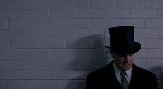
"THE KING'S SPEECH"
Director of Photography: Danny Cohen

Where we put him in the shot, it's like, here is a man who is cornered. There was a way of putting Colin [Firth] in the frame and giving him lots of head room and short-sighting him that really gives you that sense that things are uncomfortable. There's not a lot of light going into his eyes. There are deep shadows and all of that kind of builds the tension that it's not going to be an easy journey. And it breaks up the pacing. There's no chaos if there isn't any calm before the storm.

–Danny Cohen

The visual characteristics of Tom Hooper's "The King's Speech" have been a source of ridicule for some, but when I saw the film at Telluride back in September, I was immediately appreciative of its aesthetic and thematic virtues behind the camera. And cinematographer Danny Cohen puts it rather succinctly in the quote above.

The shot that first stood out for me in the film and indicated this purposeful thematic framing came in the first few minutes, as Prince Albert, Duke of York (not yet a king) prepares to deliver an address at the British Empire Exhibition in 1925. He is, as noted above, "a man cornered," and there is clearly an anxiety revealed around the character that will come to define him throughout.

Again, some may find this aesthetic clumsy or often misused, and sure, there are instances of this. But this image wasn't one of them, I felt. It laid the groundwork well and with simplistic ease.

#8

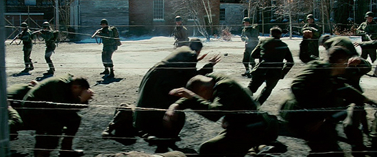
"SHUTTER ISLAND"
Director of Photography: Robert Richardson

That was entirely developed out of Marty's mind. He wanted one sustained take. Once the initial shot was fired and all the soldiers began firing, his idea was, 'Let's maintain it. I don't want to break.' It was a dolly shot, a hundred some-odd feet, maybe close to 200. And a great deal of the blood was CG blood because of the number of shots fired. We shot it outside of Boston in a small town. It was I believe a mill at one point that Dante Ferretti transformed it into what you saw.

–Robert Richardson

It was really a shame that "Shutter Island" didn't fare well with the Academy this year, and particularly that Robert Richardson's typically expert lensing was ignored completely throughout the year. But he and director Martin Scorsese nevertheless found a striking way to tell the story of a man trapped in his own fantasy, one that is, in this viewer's opinion, misunderstood to this day.

The film is full of vibrant images. And much of the visual journey is impacted more significantly by Thelma Schoonmaker's editing, but when it came to deciding upon an image (as I knew one would have to be considered for this column), I couldn't help but remember how rocked I was by the extended dolly of American soldiers taking ruthless vengeance by executing equally ruthless Nazis, part of the main character's many flashbacks.

The shot is affecting because of that extension. After the initial shock of the moment wears off, the dolly keeps moving, allowing the horror to settle in again, and more deeply.  The film marked Richardson's fifth collaboration with Scorsese to date.  Here's to many more.

#7

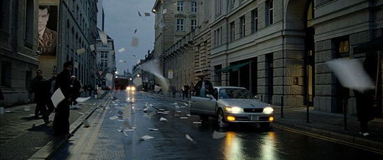
"THE GHOST WRITER"
Director of Photography: Pawel Edelman

In the original script there was no such ending. From the very beginning we were thinking of how to end this film, how to find this image that would just close the whole story. It was Roman's idea, two weeks before we were supposed to shoot that scene. We wanted an evening, magic hour shot, mysterious and dark. And we didn't want to show, we wanted to suggest that something dramatic may have happened. We took two or three takes and the last take was the best.

–Pawel Edelman

I wasn't the biggest fan of Roman Polanski's "The Ghost Writer" this year, but I was, as I imagine many were, quite taken by its final image.  The filmmaker collaborated once again with cinematographer Pawel Edelman on the film. If you haven't seen it, perhaps it's best to duck out after this paragraph, lest you be spoiled.

The final moment comes after Ewan McGregor's nameless title character ill-advisedly reveals the twisted truth he has discovered of the former British Prime Minister's death. He makes his way out into the streets of London (shot in Berlin) and meets, we think, a deadly fate, the story of which is told by countless pages of his tell-all, ghost-written manuscript flying into the shot one by one before ultimately filling the frame.

Images like this are simple but effective, and they reveal artists looking for unique ways to convey a story visually. That is, after all, the trademark of the greatest directors (and great cinematography), and Polanski found himself in their league long ago.

#6

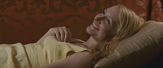
"CAIRO TIME"
Director of Photography: Luc Montpellier

This was a true dance between Patricia, the camera, the design and her wardrobe just to try to communicate in every frame that there's an evolution there. It's almost like she's 15 again and she realizes she's alive again. We did numerous takes, just to get her hand positions right and her expression. It was very closely choreographed. Any time we can make the audience feel the way she does, and it doesn't always have to be with the big vistas, that's the success of the film, in a way.

–Luc Montpellier

One of the most underrated films of the year when it comes to cinematography was Ruba Nadda's "Cairo Time." The same could actually be said of its exquisite score, but Luc Montpellier's sun-kissed photography was kind of a show-stopper for me. There are a number of frames that are captivating, both in composition and in visually telling the story.

The image that leapt off the screen at me, however, was the simple frame above of Patricia Clarkson's Juliette Grant, after spending a wonderful day with her local escort, Tareq (played by Alexander Siddig), waiting to spend time with her UN official husband.  We see the beginnings of an unexpected emotional affair (just moments after a stolen kiss) unfold crisply and powerfully in a glamorous composition.

I really don't think I could say it any better than Montpellier does above. And it's nice to know it was less a happy accident than a rigorously detailed shot that was very aware of its thematic virtues.  I could have selected any number of shots from this film, though.  It was a personal favorite in that regard.


As I mentioned yesterday, it wasn't exactly a banner year for singular images from films in 2010. And that's certainly not a crime. But more to the point, what I learned as I set about writing this piece was how deeply my personal experience of the year was reflected in my ultimate selections. It may have been tough to find what felt right for the list, but in some ways, the intensity of that digging ultimately illuminated the year's work for me all the more.

How can I not be grateful for that? In the final analysis, perhaps a year that isn't so obvious, without such a bevy of possibilities for this collective, yields a more measured and perhaps passionate consideration of the year in visual storytelling. Not to be highfalutin.  Anyway, I hope you enjoy the conclusion. Let's dive in…

#5

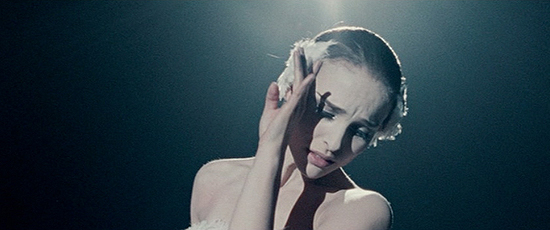
"BLACK SWAN"
Director of Photography: Matthew Libatique

We ended up waiting to do that scene because we were going back and forth on what kind of presentation it was going to be. We talked about doing it on stage or some kind of abstract set, but I opted for spotlights and the black void. Simpler was better, though the camera rotated probably eight times, possibly more. Karma, I think, helped it out because we shot it in the same space they shot the death scene in 'All That Jazz,' which is one of my favorite films.

–Matthew Libatique

Darren Aronofsky's "Black Swan," like all of his works, is, in so many words, a masterfully shot film. He teamed up with lenser Matthew Libatique again after a one-film departure and the work behind the camera is some of the most potent of the year. And choosing one shot was tough.

There are plenty of compositions that are thematically relevant but fail to, I think, capture the essence of what makes the photography so special. I ultimately decided that the third shot of the film, which begins on Von Rothbart during a heightened, trance-like "Swan Lake" number and follows to capture his ballet duet with Natalie Portman's Nina Sayers (and, to be clear, does include one "hidden" cut) establishes the language of the "oppressive" camera, as Libatique puts it, and that feather-like grace it maintains throughout.

Moreover, and granted, it comes early, but I think it is also the moment when it really registers for the audience that this will be a unique cinematic experience, if nothing else. And was it ever.

#4

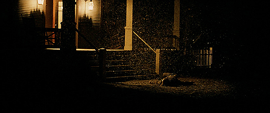
"TRUE GRIT"
Director of Photograph: Roger Deakins

We storyboarded a few shots, tracking and looking down the street at dawn, which we actually did. But in the middle of the night, when we couldn't do much else and were waiting to set up the dawn shot, we decided to do this side track-in. It's kind of lovely the way the horse just whips through frame and then is gone and the snow sort of shifts around him. And that's the one they used, I think because it's so pure and simple. That was the whole thing about the film, really. It's not fussy.

–Roger Deakins

No list such as this would be complete without serious consideration of a true modern master of the form, Roger Deakins. He just missed last year, but this year his work in the Coen brothers' "True Grit" yielded one particular image that stood out from the get-go. Indeed, it's the film's first image (and much has been written of it since I spoke with him about it in December).

In so many ways it tells a story, with style and narrative power, helped by the exposition of narration, sure, but the simplicity (as noted in the quote above) is what makes it such a perfect composition. And in a film that, for me, lacked embossed visual power (mostly by design), I relished this particular frame.

And now Deakins is set to leave film behind, likely forever. He's really turned on by what he's up to on Andrew Niccol's "Now" and he's very happy with the kinds of tools at his disposal both there and in animation. If indeed he's leaving celluloid behind, it's been a hell of a ride. And I'm sure he'll continue to dazzle on digital.

#3

"I AM LOVE"
Director of Photography: Yorick Le Saux

We wanted the feel to be rich and majestic but not luxe. We didn't want something that would look like a commercial, with too much light, too much brilliance…Luca [Guadagnino] is probably the most technical director I've worked with. He knows everything about cameras and lenses. I think he can tell you every special speed that Christopher Doyle used on a Wong Kar-wai movie in the Nineties!

–Yorick Le Saux (from American Cinematographer Magazine)*

I wasn't particularly high on Luca Guadagnino's "I Am Love" this year, but I certainly appreciated it for its design and photography. It's actually a film full of vibrant images, but one stuck out above all the others.

After a day of obsessively stalking the object of her affection, Emma Recchi (played by Tilda Swinton) finally falls into the rabbit hole of forbidden love in a brief, clipped, stolen kiss filmed entirely out of focus. For some, it's an arbitrary decision. But for me, it's perhaps the most truthful visual depiction of the intoxication that comes with a moment like that, the guilt, the excitement and the passion swirling in the same glorious mixture.

Any number of the film's wonderful images, captured by D.P. Yorick Le Saux, could have been tapped for this collective. But this one, I thought, was the most meaningful of the bunch, the most emotionally and thematically authentic, and above all, the most surprising.

#2

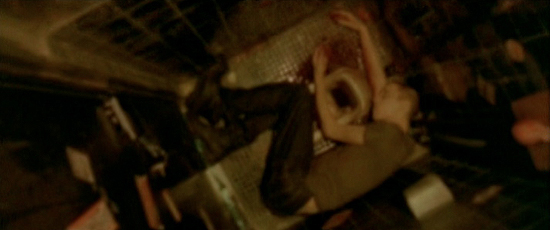
"ENTER THE VOID"
Director of Photography: Benoît Debie

One of Gaspar's great qualities is that he pushes you to experiment…If, for whatever reason, something doesn't work out as he hoped, he will never reproach you. He tells you, 'Let's try it, and if it's not good, tomorrow we'll do something else.' That allows you to take a lot of risks. He is searching, and he therefore pushes others to do the same.

–Benoît Debie, (from American Cinematographer Magazine)*

My pick for the year's best cinematography was Benoît Debie's work on Gaspar Noé's "Enter the Void," but narrowing a selection down for a piece such as this felt nearly impossible. The instinct is to say, "the whole film," because it is another example of Noé's penchant for flowing consistency with the camera, rather than intense editing.

However, the one shot that sticks out and really announces a unique visual vocabulary for the piece, unique even for Noé, comes during the first act break when the soul of lead character Oscar is sent on the journey the audience will observe for the next two hours. The camera floats up to a single naked light bulb, caught in the visual aroma of its illumination for a few hypnotic moments before turning back to the fallen Oscar, whatever force is behind it finally aware of its new place in the universe.

This kind of boundary-pushing, whether you love the film or hate it, is what is vital for the continued evolution of cinema. For some it might ring as gimmicky, but for me it is a true hallmark of expanding how we perceive this medium.

#1

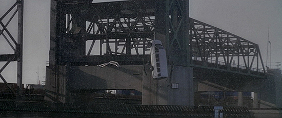
"INCEPTION"
Director of Photography: Wally Pfister

Obviously it's a very key storytelling thread. It acts as this ticking clock, an hourglass, and we knew the weight of the shot for our movie. Chris [Nolan] wanted to get the camera as slow as we possibly could, and it really is our general philosophy on everything we're doing on these films is to try and get it in camera. We went down to San Pedro and it seemed like a perfect place. It was just enough of a drop, they allowed us to do it and it sort of fit in with our shoot-up leading up to it.

–Wally Pfister

Sometimes a year-topping shot for me is all about identity, like last year's pick, which came to define as a visual reference point. Sometimes it's well-achieved complexity, like 2008′s winner. Other times it's simple striking beauty and iconography, like 2007′s winner.

This year, it was about implementation and, admittedly, a consideration partly owed to film editing. But the image from "Inception" of a van falling in slow-motion served, as Wally Pfister notes above, as a brilliant timing mechanism for a film entirely built upon its chronology, both narratively and, in some ways, thematically.

I admit to cheating somewhat, as it's not just the take above that director Christopher Nolan and editor Lee Smith continuously cut to throughout the film's third act, but a couple of angles. (The drop was executed twice and multiple cameras were staged all around for multiple options.) Nevertheless, no image meant as much when it flashed on the screen this year, and for that reason alone, it seemed the best choice for me as shot of the year.


The top 10 shots of 2010

The top 10 shots of 2009 | Kristopher Tapley

Assembling the assets for my annual take on the best single shots of the year was more of a chore this time around than ever.  Perhaps one need only look to a lackluster list of Oscar nominees in the Best Cinematography category to gauge just how underwhelming much of the work behind the camera was in 2009.  In fact, just one shot from a film shortlisted by the Academy in the field showed up on the list.

And yet, 2009 brought my personal pick for the best cinematography of the decade.  Quite the paradox, I know.

So a note on that.  Anthony Dod Mantle's work on Lars Von Trier's "Antichrist" was the most compelling, the most thematically resonant, the most daring work of the last 10 years.  But when it came to putting together my list, I could not, for the life of me, decide on an image that would make a solid entry from the film.

To be perfectly honest, I can't even decide on one that stands out as a specific piece of identity for its visual aesthetic.  One possibility would have been quite X-rated, while a handful of others seemed too much of a piece with an overall vision to be singled out.  So the film is not on the list.

At the end of the day, however, I came around to a streamlined, varied collective that represents, for me, a nice cross-section of visions, genres and, certainly, budgets.  We've once again rounded up the perspectives from the DPs recognized this year, though two instances saw a necessity to quote the director rather than a proper cinematographer.  But we'll get into those tomorrow.

For now, let me offer the same sentiment I did last year: I look forward to doing this each and every year I'm cranking out copy for your reading pleasure (or displeasure).  In my view, it is one of the best ways I can commemorate the technicians that so often find themselves overlooked this time of year.  Thanks for your patience as I put it together, and I hope you enjoy the list.

Without further ado…

#10

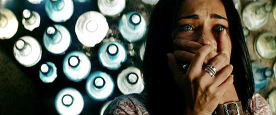
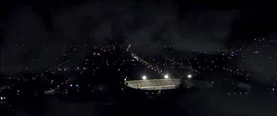
Megan Fox in Transformers: Revenge of the Fallen

"TRANSFORMERS: REVENGE OF THE FALLEN"
Director of Photography: Ben Seresin

The shot wasn't specifically storyboarded, although there was extensive pre-visualization for the rest of the scene. The bottled wall was planned, as it is typical in the Middle East. I tried to create a feeling in the room that would give a sense of safety, and that contrasted with the expanse, scale and danger of outside. I could write a book on working with Michael. Basically, he fluctuates from totally controlling to handing things over. Having said that, the aesthetic of the movie is very much his. He feels very comfortable with his bold style and is generally disinclined to experiment with new approaches.

–Ben Seresin

You won't find me springing outright for mere aesthetic beauty when it comes to this column all that often, but in the case of "Transformers: Revenge of the Fallen," I couldn't resist this composition.  In and of itself, it says little about the narrative via visual storytelling, but it is nevertheless an expertly crafted frame, impeccably lit and oozing a certain sense of dread.

Of course, it helps to be photographing a face such as Megan Fox's.  But the way the art direction emphasizes her eye color and the way the lighting manages to delicately kiss certain elements within the frame, it grabbed me from the first moment I saw it in the trailer.  I knew I'd have to find a place for it on this collective.

Michael Bay's films have a certain music video/commercial aesthetic derived from the filmmaker's time in those trenches.  Sometimes the work seems bathed in cliche, while other times, I have to say — in all seriousness — there is a fetching visual tendency that is quite unique.  This smoothly conceived image is an example of those two conflicting visual identities being reconciled in an attractive vision.

#9

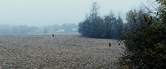
Saoirse Ronan in The Lovely Bones

"THE LOVELY BONES"
Director of Photography: Andrew Lesnie

Coming fresh from one of the most vital experiences of a young girl's life (first love) and past an energetic expression of youthful energy on the soccer field, the shot smoothly brings us to the close of one chapter and the beginning of the next. By craning up we draw on the film memory of this move as a closing motif, while also using it to introduce the arena for the coming events. The audience are already aware of the conclusion and have seen Harvey in the field at night, so the transition from a colorful environment with contrasting colors to a monochromatic desolute, denuded cornfield is smooth but immediately gets your mind racing.

–Andrew Lesnie

One of the most vibrantly photographed films of the year was Peter Jackson's critically maligned "The Lovely Bones." Plenty of credit is due, of course, to Jackson's limitless imagination, but his lenser of choice as of late, Andrew Lesnie, has had a pivotal role in bringing the director's vision to the screen since they began their collaboration on the "Lord of the Rings" franchise nearly a decade ago.

Settling on a single image was a chore, if only because it is the overall assemblage, more so than the individual elements, that is most visually arresting for me. I ultimately kept settling back on a haunting crane shot that couldn't be more eloquently described than Lesnie does in the quote above. Moving from the vibrant, rich colors of afternoon to the fog-drenched desolation of the film's upcoming dramatic swing, the movement is foreboding and thematically powerful.

Lesnie and Jackson were intrigued with this area of Pennsylvania having an interesting juxtaposition of working fields and suburbs. They spent quite a lot of time talking through the sequence, putting lights in the distant houses and filming late in the afternoon to make sure they registered, finding a balance between telegraphing the story and setting the mood of the scene.  I think they reached an artful balance.

#8

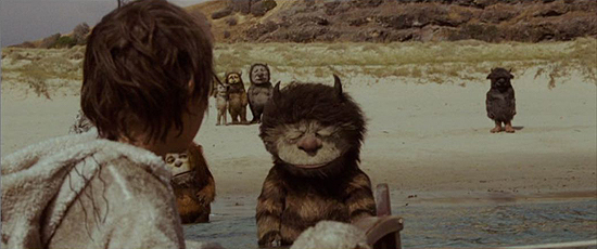
Max Records in Where the Wild Things Are

"WHERE THE WILD THINGS ARE"
Director of Photography: Lance Acord

Getting the suit performers in the water was a challenge because if the suits filled up with water, it would keep them under water. The location, Bush Ranger's Bay on the Mornington Peninsula in Australia, it has like 8-10 foot waves washing ashore. Pirates in the early 1800s would build fires along the coastline to lure ships into thinking there were settlements there, and it would cause the ships to shipwreck and they would go out and pillage the ships. It was a real miracle that it was the only day of being at that location for close to three weeks when there were hardly any waves. The ocean went completely flat.

–Lance Acord

Cinematographer Lance Acord has been working in the industry for over a decade, and much of that time has been spent as a collaborator with director Spike Jonze. As much as any esteemed director-lenser combo, their work together has established a visual identity unmistakably distinguished and unique.

I was not as taken with Jonze's "Where the Wild Things Are" as a whole as much as a great many viewers. However, there were many moments along the way that carried an emotional heft which certainly reminded me that Jonze is one of the best in the business at drawing the most impact out of an image.

So it was that the shot I chose from the film was, for me — working in tandem with Carter Burwell's measured score, of course — one of the more affecting moments of the year. Young Max, leaving the escapist world of his creation behind, stares longingly at a distraught Carol, the manifestation of all the raw emotions and dispositions a young child is capable of. In some way, it reads as an au revoir to youth. In others, an understanding that it will never leave you.  The frame seems to linger just long enough to allow for such consideration of the image's implications.

#7

Anna Kendrick in Up in the Air

"UP IN THE AIR"
Director of Photography: Eric Steelberg

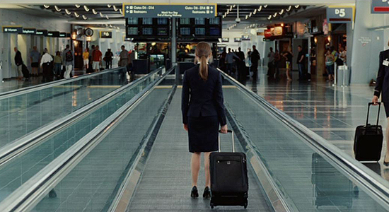
We had just finished shooting and we were moving between locations at the airport. We were walking by this walkway and Jason said, 'Do we have Anna? I want to do a shot of Anna on this walkway really quick. Can we do that?' We didn't really have permission, so he said let's talk with the airport and see if we can do it. I think he knew where he would use it tonally but he said, 'Oh, you know what, I do actually need a cutaway for Anna at the end of the movie.' It was literally spur of the moment, walking by, seeing the opportunity. And it kind of reminds everybody of her journey as well.

–Eric Steelberg

It's not always the aesthetic beauty of a shot or its various technical complexities that dazzles. It can be as simple as a concise image that speaks a thousand words based on how a filmmaker and his or her editor decides to implement it within the narrative. And that was the case with the image I chose from Jason Reitman's "Up in the Air."

Shot by longtime Reitman cinematographer Eric Steelberg, the film is trademark of the duo with its lack of fussy imagery that nevertheless carries a certain thematic weight. The quote above lays out the serendipitous circumstances by which the shot was acquired, but it's lovely to know that it didn't go to waste.

Reitman is often assumed to be a filmmaker lacking a discernible visual thumbprint, but spend more than a few minutes with any of his creative collaborators and it becomes obvious the artistry is efficient but substantial. I love this shot because, in my opinion, it encompasses that aspect of his work.

#6

Viggo Mortensen in The Road

"THE ROAD"
Director of Photography: Javier Aguirresarobe

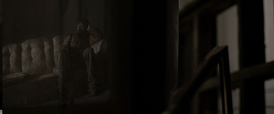
John Hillcoat, from the beginning, was very confidant in me. I could work with a lot of freedom. This shot was an improvisation. It wasn't planned. The movie doesn't have too many interior scenes and this was something we discovered right there on the set. Most of the movie wasn't storyboarded and we were really glad that this was a shot that could show like a shadow without a specific shape that is being erased and it reflects the character and what he's feeling at that moment and accentuates the drama. The water is, in a sense, erasing the past. I think it's a really powerful moment in the story.

–Javier Aguirresarobe

Lenser Javier Aguirresarobe has had quite the career in his homeland of Spain, but it wasn't until he was tapped by director Alejandro Amenabar to photograph the moody 2001 thriller "The Others" that domestic audiences got a significant look at his work. After collaborating with filmmakers like Pedro Almodovar and Woody Allen, and now with BAFTA-nominated work in "The Road," he seems poised to be an awards season player one of these days.

There wasn't a lot about John Hillcoat's adaptation of Cormac McCarthy's novel that affected me on the whole, but one sequence in particular grabbed me immediately for its sense of aching nostalgia. The moment is capped off by this image, reflected in a decrepit television set as a drop of dirty water streaks down the mirrored face of the protagonist.  It initially seems like a bit of opportunistic aestheticism but is actually a potent piece of imagery for the reasons Aguirresarobe states above.

If one can say anything about the film, it is that it builds an incredible sense of place and atmosphere. One can almost feel the grime and decay of a lost world. Much of that credit, no doubt, is due to Aguirresarobe's contribution.


Before getting into the top five, however, I'd like to spotlight a few examples that almost made the cut but just missed.

First and foremost, "Inglourious Basterds" is obviously a favorite around these parts.  Robert Richardson, as we've come to expect, offered a wonderful visual context for Quentin Tarantino's story, and though none of the shots particularly spoke to me on a thematic level, it is nevertheless worth pointing out the aesthetic impact of Shoshana's cackling specter projected on smoke and the gripping crane down to reveal a hiding Jewish family in the countryside of Nazi occupied France.

One of the unsung heroes of the season in the field was Greig Fraser, whose soft touch gave Jane Campion's "Bright Star" a beautiful identity.  The shot that has always stuck out for me was Fanny Brawne on her bed, intoxicated with love as a strong afternoon breeze blows in her window.

I was also captivated by the visual aesthetic of Tom Ford's "A Single Man," shot by Eduard Grau.  The disorienting nature of an image featuring a "Psycho" poster always stuck out to me.  It is also worth noting a shot of Jeremy Renner standing in a grocery aisle in "The Hurt Locker," speaking volumes about his character's disposition, lost in a safe world (though lenser Barry Ackroyd was not involved with the U.S. portion of the shoot, it should be noted).  And I always smile when I see the image in "Crazy Heart" of a passerby reflected in the window of Bad Blake's wrecked suburban, rushing down the hill to help.

Finally, Roger Deakins should never go unmentioned in a discussion of cinematography, and what he did on the Coens' "A Serious Man" was trademark organic beauty.  The image that sticks out to me is, ultimately, the final image of a tornado bringing the arbitrary wrath of the film's themes to a tangible form.

In any case, it was, as always, a joy digging through the year's visuals and coming up with this collective.  Even in a weak year for the medium, there are always gems worth spotlighting.  I hope you enjoy the second half, so let's get down to it.

The top five shots of 2009…

#5

Public Enemies

"PUBLIC ENEMIES"
Director of Photography: Dante Spinotti

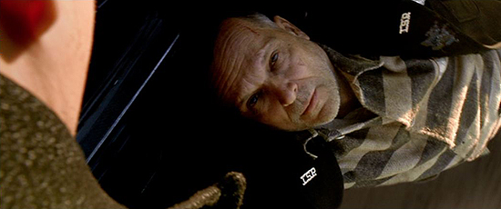
It was very complicated from the point of view of visual effects.  They rigged the car so that it was trailing sort of a platform on which the actor was lying and there was a green screen on top of it and then shot the background of the road and all the dust.  So it looked like the guy was actually pulled by the car on the road itself.  Dillinger loses his friend and mentor and teacher in this scene and the fact that something goes terribly wrong with the prison break probably sets the tone of the rest of the story.  Criminality was going in a different direction.  The look between the two actors is really wonderful and the moment is definitely very emotional.

–Dante Spinotti

Dante Spinotti first came to America in the early 1980s.  He soon had a professional relationship with producer Dino De Laurentiis, and after a pairing on one project fell through, De Laurentiis told Spinotti, "Don't worry, I'm going to put you together with a talented young director."  That director was Michael Mann, the film was "Manhunter," and the rest is history.

"Public Enemies" marks the duo's fifth collaboration (and Spinotti actually got a call for "Miami Vice," but couldn't commit).  Spinotti's work on the film has largely been debated for the use of digital photography, but none of that really figured in to my perception of one of the best shots of the year.

After breaking his comrades out of prison in the film's early moments, John Dillinger looks on as his friend and mentor is gunned down.  What makes the moment powerful and the image arresting is that the characters get this final, aching goodbye as Dillinger's friend is dragged alongside the getaway car.  I've never seen a shot like that and it became one more reminder that Mann knows how to draw a lot of emotion out of a single unique frame.

#4

Precious

"PRECIOUS"
Director of Photography: Andrew Dunn

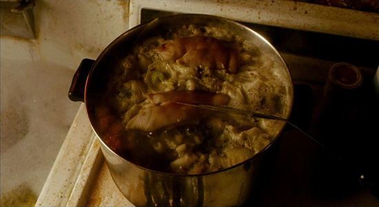
A lot of what cinematographers do has a greater meaning than the shot itself.  This shot is of course only of value within the context of the storytelling.  It reflects her situation.  The apartment is a prison and her life is a prison and within that is this prison, this cauldron of bubbling mess.  We were getting ready to move off that set and we knew we needed an actual storytelling point.  It's absolutely imperative that you get these little moments of storytelling.  You don't always know at the time of shooting what will be necessary and valid during the editing process, but it's absolutely vital that you get all the ingredients so that the editor has choices.

–Andrew Dunn

Lee Daniels brought a stylistic sense to "Precious" that few would have anticipated given both the material and his career to date.  But what resulted was a flourish of creative storytelling and an affecting drama that has a singular, penetrating vision.  Much of that vision is owed, in no small part, to British cinematographer Andrew Dunn.

One of the key sets on the shoot was, of course, Precious and her mother's New York apartment.  The goal was to shoot those scenes like the hot bed of tension they were, and one instance early on in the film stuck out to me as an intriguing commentary on everything from stereotypes to health concerns to, most definitely, thematic context.

Dunn's quote above really tells the tale.  The shot is deceptively simple: a boiling pot of pig's feet.  But what seems like a simple cutaway insert holds so much more information, and its usage in the editorial flow of the scene becomes a mark of detail-oriented visual storytelling.

#3

Jeremy Renner in The Hurt Locker

"THE HURT LOCKER"
Director of Photography: Barry Ackroyd

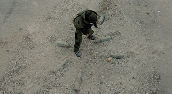
It's very informational in a lot of ways.  It's kind of a symbolic image as well, which I think gives it its strength.  The obvious thing was to show this from above to give this kind of web surrounding him, which I think is metaphorical for his position, but also the moment of ecstasy at the center of this thing, it's like he's caught in a spider's web.  And it's almost like an impossible place to be, so I think it's a little bit mystical as an image.  You wouldn't get yourself in the center of such danger, but that was obviously the character.  He was prepared to do that, which made him different to the other guys, and I think ultimately that's what the film's about.

–Barry Ackroyd

Lenser Barry Ackroyd started his career back in the early 1980s.  After paying his dues in the world of television, he hooked up with director Ken Loach for a number of projects before finally breaking onto the scene Stateside with Paul Greengrass's "United 93."  And it was that film, in fact, with its blend of intimate drama and guerrilla-like docudrama filmmaking that caught director Kathryn Bigelow's attention.

With "The Hurt Locker," Ackroyd worked with Bigelow to develop a singular frenetic style meant to emulate the high tension of the profession being dramatically documented.  But the image that stood out as iconic in the face of all of those multiple cameras and set-ups was a calmer perspective, and one that helped to define the visual identity of the film.

Staff Sergeant William James, stuffed into an ominous bomb suit and having diffused one IED already, discovers he's not out of the forest yet.  As he yanks on a chord connected to a slew of other devices, he lifts the arrangement out of the dust, yielding one hell of a gasp-inducing moment.  Intriguingly enough, given the weight of a typical IED, this is something a man wouldn't have had the strength to do, but it makes for high visual drama nevertheless.

#2

The Cove

"THE COVE"
Director of Photography: Brook Aitken

We had four hours and five minutes of drive time.  It was a prototype camera, then we had to have a battery specially made.  So the inside of this camera, the lithium batteries were around it, so it looked just like dynamite.  We tried it once and it didn't work because we had gotten it too early, and the second time we got it, it happened in the last five minutes as we were running out of hard drive space.  It's actually a dissolve.  We sped it up so that probably about a minute and a half got reduced to maybe five seconds.  We didn't mess with the color at all on that stuff, and that honesty was really important to me in that shot.

–Director Louie Psihoyos

Louie Psihoyos's "The Cove" was a feat of cinematography from the get-go.  The film is, after all, about a covert operation to capture vital footage that could galvanize and help start an activist movement.  The planning that went into getting that footage, the building of casings to hide cameras, the prototypes unitized in order to get large amounts of digital footage, is an undeniable accomplishment.

One image in particular really stood out to me when I first saw the film, as I'm sure it did many others.  One of the underwater cameras captures, in stark detail, a flood of dolphin blood filling the screen and turning the water crimson red.  The impact is helped along, no doubt, by the use of audio over the shot, the screams of terror from the dolphins filling the soundtrack.

Psihoyos put together a wonderful team for his film and much credit should be given, obviously, to DP Brook Aitken.  But when it came to this particular moment, I thought it would be best to get the director's perspective, given the overall guerrilla group effort.  And being a former National Geographic still photographer himself, I knew he would have plenty to offer to a discussion of one of the film's most arresting visuals.

#1

Paranormal Activity

"PARANORMAL ACTIVITY"
Director of Photography: Oren Peli

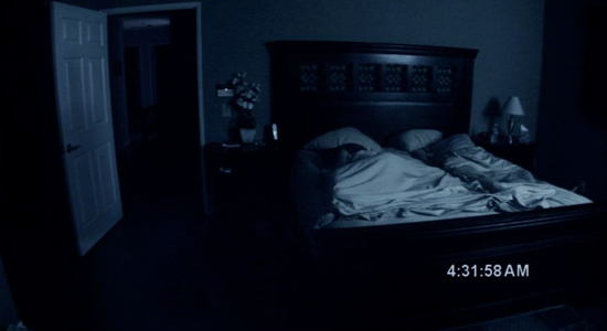
I literally spent months playing around with it and tweaking it, finding the right angle and the right colors, the right filters.  It took a lot of effort.  Once I got the positioning I had to figure out the lighting.  It had to look natural but not like we were trying to be creepy.  So I had to create a source of light that allows you to see what's going on but not too clearly.  I took a light and put it in the corner facing the wall, used filters to give it a little more bluish look and increased the contrast a little bit more.  I knew this was going to be the standard shot we were going to use.  I didn't want to keep using different shots with drastically different angles.

–Oren Peli

The year's DIY success story also happened to feature one of the most effective images of the year.  Oren Peli's "Paranormal Activity" was certainly no traditional production, with a handheld camera and a few actor friends filling out the crew.  The director himself essentially served as his own cinematographer, though mostly it was the job of actor Micah Sloat to capture the film in a home video fashion.  One shot in particular was a bit of an exception, and it immediately became the visual identity of the film.

A standard still image used in the narrative to capture what is happening to a haunted couple as they sleep at night, the composition accomplished so much with minimal lighting, some creative production design and a wide angle lens.  To the right, you have your sleeping couple, to the left, a door and, further, a hallway that plays an integral part in the plot.  However, it is one thing to be efficient with the way you choose to shoot a scene.  It is another thing entirely for your composition to take on a life of its own, capable of raising the hairs on the back of one's neck as a simple production still.

That is what Peli managed with his shot.  He tried a few different things after renovating the house for his purposes, like placing the bed on the wall to the right, for instance.  But ultimately he settled on this composition, and it couldn't have been more perfect.  It is, for my money, the best shot of 2009.


The top 10 shots of 2009

The top 10 shots of 2008 | Kristopher Tapley

I'm hoping to make this an annual tradition here at In Contention.  It's no secret we have a lot of respect for below-the-line talent around these parts, but it's nice to have a visual way of showing that appreciation.  I sat down to write this piece for the first time last year, taken by the caliber of cinematography we had to bask in throughout the year and, indeed, the awards season.  The unusually high number of lensing achievements in 2007 left a slew of images to choose from and it was difficult whittling it down to 10.

This year the challenge was of a different sort.  The field was curiously thin.  It wasn't that the talent wasn't on display.  God knows, a number of the greats were lining up behind the camera this year.  But the images weren't as instantly iconic or as viscerally gripping as they were in 2007, which might have left me a bit disappointed on one hand.  Then again, it just made searching for my favorites all the more involved and interesting, and I'm happy to offer my findings to you in this space, even if it meant doubling up.

Yes, in one instance (an undeniable one, really), a certain film found two shots popping up on the list, and nearly three.  Another film also found itself close to a second mention, but I tried to keep a balance of honesty and fairness in place as much as possible.  If a film has two of the year's best shots, it has two of the year's best shots, right?

This year, things are slightly different.  Last time around, I got a few arbitrary quotes from lensers throughout the season and plugged them into the piece where they fit best.  This year, I sought out the various directors of photography to get their opinions on the specific shots in question.  Their insight, as always, makes for a better story and, indeed, more context for the reader.  I hope you enjoy reading their thoughts as much as I did collecting them.

So, I look forward to doing this each and every year I'm cranking out copy for your reading pleasure (or displeasure).  In my view, it is one of the best ways I can commemorate the technicians that so often find themselves overlooked this time of year.

So let's get on with the list…

#10
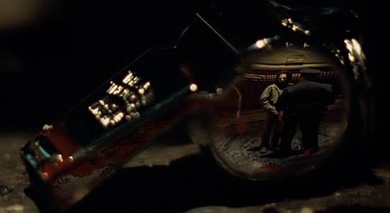
Milk

"MILK"
Director of Photography: Harris Savides

It's really simple and it wasn't planned at all.  We were shooting the scene and the last shot that night was a close-up of the whistle.  Gus and I were talking and we thought it would be great if we saw the whole scene in this whistle, and Gus made it happen in post.  They took one of the shots and put it in this shot, the close-up of the whistle we got.  I was surprised that it happened at all.  But that kind of stuff, especially with Gus, is very on the fly.  There's no storyboards.

–Harris Savides

Ask any working cinematographer who the two or three best lensers are in the game, you're likely to hear Harris Savides every single time.  In his collaborations with David Fincher, Jonathan Glazer and, prolifically, Gus Van Sant over the years, Savides has amassed a distinguishing visual portfolio that would likely catch the late Stanley Kubrick's eye.

Hopping behind the camera for the fifth time with Van Sant at the helm, Savides brought his distinctive sense of composition to the director's signature creativity yet again.  Perhaps one of the more straight-forward of their collaborations, the photography in "Milk" was nonetheless a well-implemented storytelling device for the life of San Francisco politician Harvey Milk.

The shot that stuck out to me when first watching the film might be considered too gimmicky to some, but I couldn't help a crooked smile at the playfulness on display.  I was later somewhat disappointed to learn, as the quote above reveals, that the shot was achieved through visual effects, but it wasn't enough to erase the image from my mind: a distressed Milk confronts a police officer following a violent night of gay-bashing in the Castro as a whistle — a plot point raised earlier in the film — lies blood spattered on the ground, reflecting the scene throughout.

#9
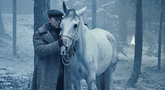
Defiance

"DEFIANCE"
Director of Photography: Eduardo Serra

I like this shot very much as well because you have all that emptiness and Daniel is separated from the rest.  When you have all the snow, all the white around, you have reflections everywhere.  That creates a mood that's very special.  I didn't do anything with this shot other than giving the film a certain look using a specific film stock.  There's not much you want to do with lights because you have all this white.  I'm always very interested mainly by the storytelling rather than anything else.   It's very simple, there's nothing, no bells, no nothing, it's very simple.

–Eduardo Serra

Eduardo Serra cut his teeth on the French cinema of the 1990s.  He broke through to North American audiences with Michael Winterbottom's "Jude" and Iain Softley's "The Wings of the Dove," the latter earning him an Oscar nomination, before dazzling popular audiences with Vincent Ward's "What Dreams May Come" and M. Night Shyamalan's "Unbreakable."   But most remember him for his gorgeous work on Peter Webber's "Girl with a Pearl Earring" in 2003, which brought him Academy attention for a second time.

Serra has been director Edward Zwick's D.P. of choice for the last couple of years, lensing "Blood Diamond" in 2006 and, most recently, the World War II drama "Defiance."  In many ways Serra is a perfect fit for Zwick, who has proven himself quite attentive to the visual splendor of his films (lauded lensers Roger Deakins and John Toll have been frequent collaborators).

Serra's finest work in "Defiance" comes during the film's extended winter sequence, a detrimental time for the Bielski brothers and their patchwork community seeking asylum in the forest of Belarus in the early 1940s.  That detriment is paradoxically captured in the most beautiful blue-white hues as snow (both fake and real) covers the scenery.  But the shot that stuck out to me was both an interesting (and heartbreaking) plot point and the moment that really snapped me to the attention deservingly paid to Serra's photography.

#8
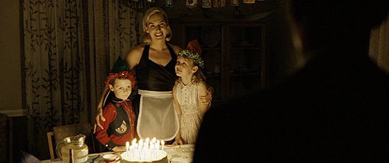
Revolutionary Road

"REVOLUTIONARY ROAD"
Director of Photography: Roger Deakins

You kind of work the shot by what's demanded by the story.  The front of the shot is just Frank coming in the door and the exterior of the porch light that sort of rims him as he walks in.  It was an aesthetic reason because it helps set the mood of the shot.  We wanted this pool of warm light, sort of coming through this dark room and not knowing what you were going to expect.  It was about capturing the surprise of Frank seeing that scene and that mixed emotion.  And it wasn't lit entirely by the candles.  I asked the art department to make a cake that was big enough that I could hide a little gag light behind it.

–Roger Deakins

There are few lensers as salty, candid and talented as Roger Deakins, the most Oscar-nominated cinematographer of all time without a statuette to his credit.  He has worked with the greats, from Martin Scorsese to frequent collaborators the Coen brothers.  This year he sat behind the camera on three major productions: John Patrick Shanley's "Doubt," Stephen Daldry's "The Reader" and Sam Mendes's "Revolutionary Road."

"Road" is littered with an embarrassment of visual riches, an assemblage it seems only Deakins could deliver with such consistency.  But it was surprisingly difficult to settle on one frame that really stuck out, because unlike many of his works, the film is more memorable for its overall visual atmosphere than it is for this shot or that.  But I eventually settled on an eerie image, the camera tracking with Leonardo DiCaprio's Frank Wheeler after a day of infidelity, through the darkness to reveal his family, lit by birthday cake candlight to wish him a happy birthday.  The beauty and moodiness of the shot mixes together with the subtext of his recent actions in an unsettling way that was certainly intentional.

Deakins has filled in wonderfully as Mendes's D.P. of choice as of late, stepping into the massive shoes of lensing legend Conrad L. Hall.  But Deakins, who was close friends with Hall before Hall's death in 2004, says he considers it an incredible honor, for obvious reasons.  Most notable, however, is Mendes's talent for utilyzing the best in the business.

#7
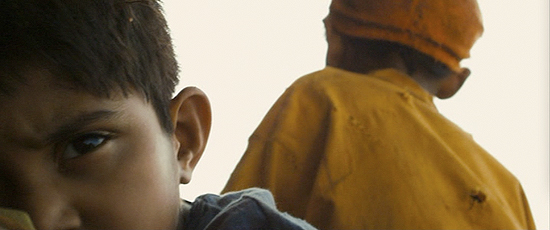
Slumdog Millionaire

"SLUMDOG MILLIONAIRE"
Director of Photography: Anthony Dod Mantle

I like to experiment, but I only ever experiment because of the story.  We thought bringing him really close in the foreground would be good to create that distance between the two boys and create that dramatic comment.  One of them is thinking about something else and the other is simply thinking about surviving and moving on.   It's a sad image too because you can't help the connotation that these boys have lost their mom, you know.  And those things don't get storyboarded.  Generally speaking when you're working with Danny, every shot feels as important as every other one.  And that shot is an example of the way we work .  He'd have an idea for a picture and I'm there to help him as a visually trained composer of images — that's my job.

–Anthony Dod Mantle

Anthony Dod Mantle made his name alongside Thomas Vinterberg and Lars Von Trier during the Dogme movement of the late-1990s.  The naturalism at the forefront of Dogme's dogma nonetheless finds itself at incredible odds with the cinematic sensibilities of director Danny Boyle, who has worked with Mantle on three films since 2003′s "28 Days Later."

Still, Mantle has found a way to let his background influence his work with filmmakers like Boyle and Kevin Macdonald in the most pleasantly surprising of ways, and such was the case on "Slumdog Millionaire," perhaps the most visually dynamic piece of cinema to be released in 2008.

Much like Deakins's work on "Revolutionary Road," Mantle's work here doesn't easily allow for one or two easily remembered images.  It is a construction of ideas that pop with life, camera innovations that are astounding and viscerally effective, but more across the board than selectively so.  I went back and forth on which image to choose, and I always came back to the same frame, young Jamal in the foreground, lost in thought and heartbreak as a young Salim looks toward renewed life in the background.  The moment comes during the film's energetic train montage sequence and really, I don't think I could add more than Mantle has in the quote above, so I'll leave it at that.

#6
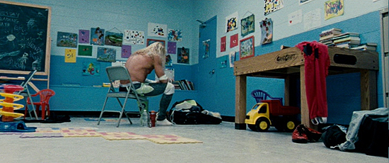
The Wrestler

"THE WRESTLER"
Director of Photography: Maryse Alberti

The first time I spoke to Darren, it was very clear that the inspiration for the visuals of the film was in the work of the Dardenne brothers, who directed "Rosetta" and "L'Enfant."  That first shot was going to be much more complicated, a low, hand-held tracking shot that was going to move in on Mickey and turn around and start to discover his face.  We tried it and Darren decided it was much too complicated.  We decided to leave the camera in the back of the room with Mickey very small in the frame with his back to us and I think that right away it established the isolation of the character.

–Maryse Alberti

When director Darren Aronofsky went back to the drawing board on "The Wrestler," he shrugged off the sleekness of "The Fountain" and the indie-chic of "Pi" and "Requiem for a Dream" in favor of a much more naturalistic visual approach.  Hiring documentary lenser Maryse Alberti was a smart move in the realignment of his career and his newfound passion for performance.

"The Wrestler" is filmed in such a way as to invite the viewer into the life of Randy "The Ram" Robinson.  While Mickey Rourke is laying bare his soul on the screen, Aronofsky and Alberti are meeting him half-way with an affectionate portrait and a sense of realism that might remind the viewer of one of the many examples of cinematic non-fiction Alberti has filmed in her time.  The shots linger and observe, omniscient but intimate, obliterating the notion that a camera is even there.

The most powerful image is probably the opening frame, one packed with as much subtly as it is blatant thematic comment.  That it was a fall-back plan of sorts, and never prepared as such, is somewhat shocking considering the artistic merit it exhibits, but such is the essence of filmmaking, cooking imagery on the fly and tapping into the hidden truths that trimmed production fat can reveal.


Before digging into the top five today, I thought I would give a shout out to the images that almost made the cut, and there were a few.  For instance, who can forget the fateful shot of Harvey Milk ascending the stairs of San Francisco's City Hall as Dan White stalks the corridors in the distance?  Similarly, how about the image of White from behind as he psyches himself into assassinating his fellow politician?

Meanwhile, there was an array of images to choose from in "The Dark Knight," certainly too many to name here.  As beloved as the image of Heath Ledger's Joker is, breathing in his freedom and tearing off into the night in a Gotham patrol car, I chalk that up to performance as much as if not more than Wally Pfister's work behind the camera.  But the iconography of James Gordon standing, arms crossed in front of the Bat signal was a difficult one for me to snub (for reasons you'll find out after the jump).

"Let the Right One In" will show up on today's list, but one other image that came very close to making the cut for me was that of Eli's victim bursting into flames on a hospital bed once exposed to sunlight streaming in through the window.  And though Maryse Alberti's work on "The Wrestler" has already been represented, I was always tickled by the creativity of The Ram's walk through the bowels of a supermarket deli, mirroring his walk to the ring.

Finally, Danny Boyle's "Slumdog Millionaire" is loaded with wonderful cinematography.  The image I chose yesterday had personal value, but I also loved the long shot of young Jamal and young Salim on the roof of a train to start the film's exciting montage, as well as the three-shot overhead view of the Mumbai slums during the film's opening sequence.

This is to say nothing of the work from fine lensers on films that just didn't make the cut for whatever reason, but were nonetheless wonderful examples of cinematography this year.  "The Fall" (Colin Watkinson), "Gomorrah" (Marco Onorato), "The Reader" (Roger Deakins and Chris Menges) and "Vicky Cristina Barcelona" (Javier Aguirresarobe) are just a few examples.

But enough of the also-rans, right?  Let's get on with the real show: the five best shots of 2008…

#5
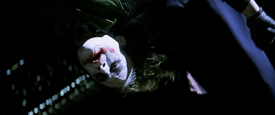
The Dark Knight

"THE DARK KNIGHT"
Director of Photography: Wally Pfister

Chris and I had long conversations discussing the best way to film this scene.  This is the last we see of the Joker in the film and sadly one of the last days we were ever to work with Heath.  We went back and forth trying to decide whether to leave him upside down in the frame for the whole scene or rotate the camera and have him right-side up and we did not make our decision until that day. Chris felt that, as long as we showed the camera rotation, and let the audience "in,"  that the scene would play better with the Joker's face upright. The end result is, of course, this eerie right-side-up image that defies gravity. We kept the illusion of the police helicopter flying around to motivate my overexposed blue, flickering light on the Joker's face throughout.

–Wally Pfister

Christopher Nolan's "The Dark Knight" is perhaps the most photographically sound film of 2008.  To say nothing of the breathtaking innovations Nolan and D.P. Wally Pfister ushered to the mainstream by tinkering with IMAX technology, the film is composed, moment-for-moment, with the utmost expertise and thematic intent.  Choosing just one image would bee a fool's errand.  I had to go with two.

Of course, as mentioned in the lede, there are numerous frames to choose from.  Click here, here, here and here for just a couple more examples.  My own favorite image might be this one, but I had to answer to a higher calling for the purposes of this list, shots that truly said something, capturing iconography and creative liberation all at once, regardless of my fanboy glee over seeing images from my favorite graphic novels duplicated on the screen.

For the first of two "Dark Knight" images selected, I chose a shot that brings an extra element of cinematic uniqueness to Nolan's already classic vision of the character: the Joker, finally in the Batman's clutches, suspended high above Gotham as he taunts his archenemy further.  The off-screen pain of the line "You and I are destined to do this forever" will always sting, but for Pfister and Nolan's part, Heath Ledger's final moments in the film are captured in an unsettling manner worthy of the actor's maniacal creation.

#4
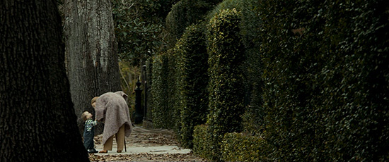
The Curious Case of Benjamin Button

"THE CURIOUS CASE OF BENJAMIN BUTTON"
Director of Photography: Claudio Miranda

David likes being able to roll instantly and he likes the convenience of HD, but of all the shots that was probably one of the easiest ones of the whole movie.  It was just trying to be as naturalistic as possible.  I get drawn to it more emotionally, because it's not busy with light or camera movement at all.  There's no real equipment on that shot.  There's just a camera and a couple of actors out there and we were blessed by a little bit of overcast and there you go.  It was one of those happy accidents.  And it just seemed to have a great mood to it, the tree kind of pushed in on the side with this nice bell shape.  Everyone has their favorite shots but a lot of people react to that one.

–Claudio Miranda

Whether or not the Academy's cinematography branch finally warms up to digital photography hardly matters in the face of the technology's accelerated proliferation in the film industry.  But while we've seen nice work from lensers like Dion Beebe and Dean Semler in that vein in the past, I don't think anyone has really conveyed the potential for gorgeous digital imagery the way Claudio Miranda did on David Fincher's "The Curious Case of Benjamin Button."

Miranda has been a part of Fincher's creative ensemble for a number of years.  He worked on "Seven," "The Game," "Fight Club" and "Zodiac" before taking the helm of a Fincher camera department for the first time this year.  However, he cut his teeth as a lighting technician, which goes a long way toward explaining his wonderful eye for visual ambiance.

"Button" is packed with beautiful imagery, but it can be difficult at times to discern what is digitally enhanced.  The red dress sequence that is so beloved, for instance, wouldn't have had the same effect if Fincher hadn't spiked the red in post.  But the shot that always causes me to gasp a little everytime I see the film is the one you see here, startling on an emotional level but carrying with it an eerie weight that sums up the film so well atmospherically.

#3
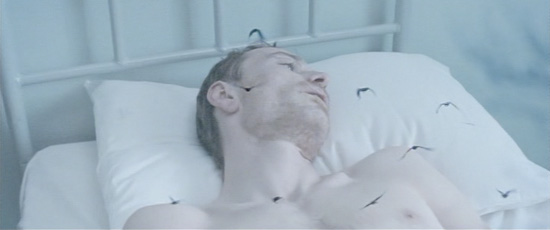
Hunger

"HUNGER"
Director of Photography: Sean Bobbitt

It is an interesting shot in that it sort of highlights the working relationship between myself and Steve McQueen.  He said it was as if the camera was a balloon bouncing around the room, always looking at Michael.  There was no visual reference that he could think of but he had a gut feeling that there was something about that movement of the camera.  It highlights Steve's creativity because he's coming from the world of art.  We had several discussions about how you get a camera to move like that, coming up with all sorts of rigs — including large balloons — none of which were really practical.  As we were getting more into the shoot, the birds started to grow in importance, and for Steve it was suddenly clear that it wasn't a balloon, it was a bird, and the bird represented Bobby Sands' soul, trying to escape this room.

–Sean Bobbitt

Steve McQueen's "Hunger" is a visual masterpiece, loaded with captivating images sprung from the mind of a contemporary artist in this, his first feature film.  One could talk all day about the virtues of the film's narrative structure, a broken string of moments that catches its stride in an extended glimpse of hunger striker Bobby Sands (played brilliantly by Michael Fassbender) in his final days of incarceration at HM Maze Prison outside of Belfast.

Sean Bobbitt has spent much of his time in the world of television as of late, but it seems a collaboration with McQueen was all it took to unleash a ferocious sense of creativity in the lenser.  He captures the Maze with a number of clever and thematically potent angles and hues, equally effective with elaborate camera movement and the stillness of visual commentary.

The shot that stuck out in my mind comes late in the film, perhaps the most unusual of the numerous memorable images on display.  The camera hovers above Fassbender as he goes into a series of convulsions, forgoing whatever fluids might have remained in his stomach.  It then pushes in swiftly on the actor as the viewer hears the sound of bird wings flapping, then out again, repeating the movement a number of times before resting in a somewhat defeated manner.  I do it no justice here; the movement is excellently explained by Bobbitt above.

#2
The Dark Knight

"THE DARK KNIGHT"
Director of Photography: Wally Pfister

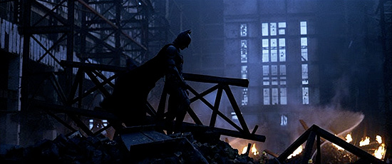
The Battersea Power Station has such a wonderful history and was perfectly suited for our story. There are very few locations where you can find that kind of scale.  Chris really likes these iconic Batman images (the helicopter shot of Batman on top of the tall building is another) and usually uses them in very powerful, emotional moments in the film.  All that weight was presented on a massive, eight-story screen when viewed at an IMAX theater.  I was quite pleased with the duality of the color palette, the blue of the dawn light mixed with the warm, orange of the fire light. We decided to shoot this as a dawn scene, as it allowed us to see much more of the destroyed Battersea interior than we would have had it been a night scene.

–Wally Pfister

As Pfister notes in his comment above, one of the things Christopher Nolan has nailed with his Batman franchise is the iconic imagery of the character.  The first shot that really put fanboys on the edge of their seats in 2005 was that sweeping helicopter shot of the Caped Crusader perched atop a Chicago skyscraper in "Batman Begins."  At the time, comic artist Jim Lee called it his favorite image from the series's reboot.

Translating that sense of iconography to IMAX photography was just one more way of adding a sense of majesty to the character and, indeed, lending a greater sense of importance and urgency to the events of "The Dark Knight."  And there was ultimately one image that came to define the film for me, both in this way and in a general sense overall.  The choice was simple.

A battered but unbroken Batman stands on a pile of blown-out rubble, fires blazing all about him, looking down with the heavy heart of a shadowed hero.  Using the Battersea Power Station in South London only amplifies the grandiosity of the image, but what is most startling is that, though it seems instantly iconic, there is no real reference for the composition, no frame in a comic book to inspire the image.  It was born out of Nolan and Pfister's creativity and dedication to capturing the essence of a character that has struggled to find that identification on the screen for decades.

#1
Let the Right One In

"LET THE RIGHT ONE IN"
Director of Photography: Hoyte Van Hoytema

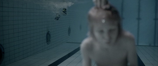
This shot can be seen as a compressed example of how we tried to treat the story throughout the film.  It pretty much followed the ideas Tomas and I had about how to show cruelty, action and supernatural elements and where to put focus.  We wanted to be close on Oscar and the way he experiences the situation, as well as have a platform to tell everything that happens in one shot.  I am not sure if it is the most "pretty" frame of the film, but it was very exciting to try to unravel and solve the puzzle of all present elements in this shot, technically, as well as emotionally.  I am very proud of Tomas and the way he dared to go with a climax that is so violent, but restrained and subtle at the same time.

–Hoyte Van Hoytema

Tomas Alfredson's "Let the Right One In" has been considered one of the year's best films in many quarters.  It is a burst of creativity and ideas that stretches far beyond the realm of the visual.  I think vampire chic has enjoyed its 15 minutes.  And it wasn't working anyway.  When Hollywood wasn't raping and pillaging the work of Richard Matheson it was copying and pasting the work of Stephanie Meyers, both times to box office success of course.  And who can forgive the many faults of television's "True Blood?"

Along came Alfredson and his brilliant D.P. Hoyte Van Hoytema and, hopefully, they've changed all that.  Who knows how wretched the American remake of "Let the Right One In" will be, but that a film this dynamic and artistically exciting will serve as a jumping off point certainly nurtures a sense of hope.  Then again, fool me once…

Like many of the films on my list, this one is scattered with memorable images.  The sound work should be noticed as much as Hoytema's work behind the camera, by the way, but we're focused on cinematography here, and there was really only one image worth considering, not merely as the best frame from the film but as the year's single greatest shot.  Young Oscar (Kåre Hedebrant) is held under water by a pack of bullies who've haunted him throughout the film.  At first the audience isn't quite sure what is happening above the surface, but as the bloody pieces begin to fall into place, we know.  And we're dazzled.  This is the moment that finally made the film click in my head as one of the year's best.  I can't imagine that I'm alone.

And that's a wrap!  This is, without a doubt, the feature I look forward to writing each year more than any other.  Again, I hope you all have enjoyed the list as much as I did compiling it.  These were my 10, but feel free to cut loose with your picks for the year's best shots in the comments section below.


The top 10 shots of 2008
The top 10 shots of 2007 | Kristopher Tapley

2007 was, to my mind, the greatest year for cinematography in a long, long time.  I can't recall the last time I was so thoroughly impressed with the visual artistry of film after film like I was last year, and I attribute that to the intriguing spark of creativity underway in the film medium as of late.  Newcomers and veterans alike were putting awe-inspiring images on film, some of the seasoned pros besting their already exceptional portfolios.

I wanted to do something special in the way of commemorating the efforts of these individuals, and so I set out to interview a number of them as the year drew to a close.  Sadly, I was never able to piece those interviews together in a proper story like I would have wanted, but in recent weeks it has occurred to me that it may be just as beneficial to offer up something you don't regularly see: a personal compilation of the greatest single images from the cinematic year.

And so it goes that I offer the Top 10 Shots of 2007, a two part piece that will run down what I felt were the best of the best in a year full of exceptional cinematographic work.  Today, I'm running down shots 10 through 6, and tomorrow, we'll wrap it up with the top 5.  Mixed in you'll find sporadic comments from the lensers in question, as I feel it only appropriate that I give that small gateway into their process for readers and viewers alike.

I hope you enjoy reading this as much as I did compiling it.

#10

No Country for Old Men

"NO COUNTRY FOR OLD MEN"
Director of Photography: Roger Deakins

I suppose in a way it was business as usual, but business is never usual with [the Coens], because every film they've done is so different.  And I think we felt quite a responsibility to the novel.  Visually, graphically, it was a very different look than what we'd been doing together up until then.  It was like a Peckinpah western, the old sheriff standing in the way of the way the world was going.

–Roger Deakins

There is an embarrassment of iconic images peppered into Roger Deakins' greatest creative collaboration with the Coen brothers to date.  Any one of them could be spotlighted as indicative of theme or substance, tone or atmosphere throughout.

There is, of course, the instantly classic shot of Lewellyn Moss sprinting through the open country in the dead of night, the headlights of a pickup in hot pursuit, silhouetting his figure against a pitch black night (used frequently in the film's PR).  And who could forget any number of frames from Moss and Chigurgh's hotel confrontation, the darkening of a hallway light bulb, the jaundiced yellow swaths of street lamp bathing the interior of the room, Moss lying in wait, shotgun in hand?

For me, the image that always stood out is the one that gave me the most discernible start.  As much attribution may be given to the editing of the sequence, but there is Moss, waltzing back into the lion's den of a drug deal ambush and discovering he might not be alone.  He turns back to the ridge and there is his truck, suddenly accompanied by another and visually framed at such a distance as to play a trick on the viewer.  "Wait, is that…?  Fuck!"  It isn't the prettiest frame of the film, but it is the one that sticks with me, the one that, more than any other, captures the sheer anxiety of the endeavor.

#9

Into the Wild

"INTO THE WILD"
Director of Photography: Eric Gautier

One of the unsung heroes of the season this year had to be lenser Eric Gautier, who captured Sean Penn's "Into the Wild" on film in such a way as to both electrify and provide a basis for deep consideration of theme and character.  Gautier was tasked with depicting the American frontier through the eyes of disenchanted youth, and in so doing he managed to plumb considerable depths with his imagery.

Take this shot of a bald eagle tearing away at the rotting flesh of a sacrificed moose.  Chris McCandless, so desperate to prove to himself and to, in some small way, humanity, that he could live off the land in Alaska, he hunted and killed the animal, attempted to smoke the meat but found the process too much to complete, too beyond him to handle.  There are cutting themes in this flawed film about the country weighing on a person's psyche, about the desire to leave it all behind and escape the small tragedies of everyday life.  The American way is there, though ever elusive, picking away at the flesh of scattered dreams.

It's a subtle image, on screen for maybe five seconds, and likely dominated by the pack of wolves partaking in the feast.  But it resonated with me.  It struck a chord that made me all the more proud of Sean Penn for the dedication he put into this effort, no matter my opinion of the final result.  And Gautier is at the forefront of that vision, a brilliant visual guide through the wild of America's wounded heart and bitter soul.

#8
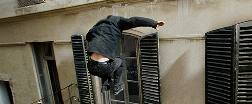
Zodiac

"ZODIAC"
Director of Photography: Harris Savides

Steven Shore had these banal kind of images of America in the 70s, which were a great reference for colors and for props, and for the world that we were to inhabit and make the audience feel they were watching.  Something that did concern me, however, was that it was very dialogue-driven, and I wanted to do things that were more cinematic.  But all of David's references were these wonderful movies that had this structure that I became interested in.  The approach that he wanted to take was exciting for me.

–Harris Savides

Harris Savides sat behind the camera of three solid visual achievements in 2007: Ridley Scott's "American Gangster," Noah Baumbach's "Margot at the Wedding" and David Fincher's "Zodiac."  His versatility can be felt throughout his work on these vastly different projects, but it was on the latter that he proved a certain capacity for mainstream artistry as of yet untapped.

Much of Savides' work in the film was buttressed by visual effects.  In many cases, the seams are so transparent as to become a mere afterthought, but one shot, simply accentuated by CGI in the background, really spoke up on the film's upcoming presence and period immersion.  Not quite the opening image (the second, actually, following a CGI establishing shot of the Bay Area during the 4th of July), the shot is a trek through a celebratory neighborhood as Three Dog Night's "Easy to Be Hard" settles into the bones.

The tone Savides sets with his framing and lighting is one of instant foreboding, an almost sickening sense of impending doom.  When I think of "Zodiac," I immediately think of this image and something cold sits in my stomach.  It gets me every time.

#7

Control

"CONTROL"
Director of Photography: Martin Ruhe

Black and white always has the danger of being too stylized, but Anton is great at being efficient and taking risks and not questioning too much.  That gave us confidence to go ahead with things.  We wanted to make the film really personal and daring in a lot of ways.

–Martin Ruhe

Cinematographer Martin Ruhe had been a frequent collaborator of director and photographer Anton Corbijn in the music video world, where Corbijn had cranked out more than a few shining examples of visual acuity (Nirvana's "Heart-Shaped Box," Rollins Band's "Liar").  When the time came for Corbijn to make the leap to feature films, it was only fitting that he bring Ruhe along to attack the photography of the endeavor.  Indeed, the lenser and filmmaker managed to capture their fair share of iconic imagery on the way to cinematically immortalizing Joy Division front man Ian Curtis.

The shot that springs to my mind is one that not only assures the viewer of Ruhe's skillful hand behind the camera, but one that announces Corbijn as a visually dynamic filmmaker who promises to be an exciting talent to watch in this new phase of his career.  Curtis walks down the street having donned his infamous "HATE" jacket on the way to the local employment offices as Joy Division's "No Love Lost" attacks the cerebellum.  It's the perfect transition into the second act of the film and really sucks the viewer in.

There are, of course, numerous other images of note in "Control."  The final shot of smoke rising in the extreme bottom of the frame following the heart-wrenching denouement might come to most minds.  But whatever your favorite shot, it is refreshing to see a first time director so comfortable with the narrative medium and so capable of conveying visual meaning, thanks in no small part to the work of Ruhe, a solid fit for Corbijn's expressionist tendencies.

#6

Quiet City

"QUIET CITY"
Director of Photography: Andrew Reed

The Prospect Park scene was the best example of a happy accident.  It was not something that Aaron and I talked about a great deal.  Though there were some basic ground rules.  Obviously the movie is 80-90 percent handheld, and that was a conscious choice.  We also made the decision that all of the cityscape shots were going to be completely static and separate from those other shots.  We didn't want there to be any additional presence other than the city.

–Andrew Reed

It's no secret that I fell in love with the warmth and realism of Aaron Katz's "Quiet City," but something that always resonated with me was the subtle and yet purposeful work from lenser Andrew Reed.  In a movement consistently spotlighted for its minimalism ("mumblecore," the kids are calling it), I find myself arguing for "Quiet City" as an entity unto itself.  Much of my reasoning has to do with Reed's efforts in setting the film apart visually, while at the same time clearly working with the influence of his idols in the field.

The shot that became the film's calling card has, in effect, become the film's cliche.  But cliches aren't always a whitewashing of reality, and this image has the goods and captures the heart of Katz's film in one fell swoop.  The central duo, Jamie and Charlie, decide upon a spontaneous race in the middle of a sun-washed

park.  Noticing the descending sun and the opportunity to capture something special, Reed set the camera on the ground and aimed into the light, capturing the characters in a long take as they run away from and then back toward the frame.  It sounds trite but it is, in fact, beautiful.

I really hope Reed and Katz continue to collaborate on future efforts, because they seem to have a chemistry that unfolds on the screen in very special ways.  Sometimes shots are a stretch or otherwise self-aware, sometimes the opportunity to break out of a visual shell is lost, but more often than not, they settle into a splendid groove and will surely continue to solidify their visual voices.


#5

Michael Clayton

"MICHAEL CLAYTON"
Director of Photography: Robert Elswit

We were completely ripping off New York filmmaking from the 1970s, things like "Klute" and pretty much everything Owen Roizman has ever shot.  But Tony's sense of these things was not lots of little pieces; he loves making kind of graphic frames that play as long as possible.

–Robert Elswit

Robert Elswit had a hell of a year in 2007, finally getting his due from the American Society of Cinematographers who awarded his work in Paul Thomas Anderson's "There Will Be Blood."  There was another film featuring Elswit's unique signature, however, that flew under the radar for its considerable attention to composition and camera movement: Tony Gilroy's "Michael Clayton."

Much is made of the film's final sequence, a long shot focused on Clayton as he rides away from the hysteria in his life, desperate for his cab driver to "just drive."  But a companion shot from earlier in the film was just as arresting, if not more so, as a purposeful point of transition to the second half of the endeavor.  A long tracking shot that never misses a beat, both behind and in front of the camera, the scene detailed is the expert, painfully clinical execution of Arthur Edens, played to an award-worthy T by Oscar nominee Tom Wilkinson.

The final image is steeped in theme, and an initial tracking sequence under Edens' opening monologue pulls the viewer into the film's interior world, but this particular shot is so cold as to be frozen in its depiction of something at once gruesome and strangely beautiful, fluid.  I'm not privy to whether it may have been a directorial decision, though I suspect it may have been, but it is the crown jewel in a film packed with precision from Elswit.

#4

There Will Be Blood

"THERE WILL BE BLOOD"
Director of Photography: Robert Elswit

If we were stealing from anybody, it was a little bit of Kubrick.  But that tends to be kind of Paul's taste anyway.  But in terms of temperature — and we've said this a million times — it was 'Treasure of the Sierra Madre.'  We really wanted a sense of that.  Oil drilling was a really hard life, and I think Paul was absolutely obsessed with capturing that.

–Robert Elswit

Elswit bumps up against himself here, one of the countdown's two individuals with dual representations.  The imagery throughout "There Will Be Blood" is instantly classic, much like it's sister film, "No Country for Old Men."  The ASC has seen fit to reward Elswit for his work on the picture, and with due cause.  The result of "Blood" is a testament to the artistic splendor of the lenser's 5-film collaboration with director Paul Thomas Anderson.

The shot that stuck out in my head the very first time I saw the film spoke to me so deeply that I referenced it in my initial review:  "A few years trickle by as Plainview adds onto his enterprise until finally, oil. A black-tarred hand reaches to the sky and suddenly you sense the influence of Stanley Kubrick on the film. Like the apes who discovered weaponry in "2001: A Space Odyssey," Plainview has come upon the object that will dictate America's destiny for the next century and more."  I don't thiink I could say it any better now.

Indeed, the Stanley Kubrick reference is palpable, and obviously, Elswit is on the record as saying the work of the highly visual director was referenced on the film.  It is perhaps the most Kubrickian image of the year, which is saying something, given the number of times the filmmaker's name has been evoked in critical discussion of the year's cinema.

#3

Atonement

"ATONEMENT"
Director of Photography: Seamus McGarvey

Joe and I are very clear that cinematography must be in service of the story.  With the unfettered imagination, meaning can just explode and proliferate.  So we wanted to keep in line with the script's insistence on no adjectives, keep things clean as a whistle, very clear and with unfiltered light.

–Seamus McGarvey

Perhaps the most talked about shot of the year is the 5 minute-plus tracking scene of Dunkirk in Joe Wright's "Atonement."  Seamus McGarvey served lensing duties on the pic, but camera operator Peter Robinson perhaps deserves most of the credit for that shot.  However, it is an image just moments later that was most striking to me and, indeed, more thematically relevant.

Robbie Turner, robbed of four years of his life due to false charges, painfully in love with Cecilia Tallis, desperate to return to her arms, is injured, his life draining away, his exhaustion taking its considerable toll.  In front of a theater screen, his anguish plays out expressionistically behind him as a black-and-white romance shines bright on the screen, two lovers locked in a kiss.  Robbie holds his head in his hands, everything…slipping away.

This shot means so much more than any other image in the film.  And while McGarvey and Wright's (and Robertson's) Dunkirk odyssey has been unfairly maligned as it is, I have to say, not enough attention has been paid to the visual splendor found elsewhere.  And I still contend this might be a dark horse in the cinematography category at this weekend's Oscar ceremony.

#2

The Bourne Ultimatum

"THE BOURNE ULTIMATUM"
Director of Photography: Oliver Wood

Thankfully, Universal's "Bourne" franchise finally received its fair share of film awards acknowledgment this year as the best film in the series received three Oscar nominations.  Sadly, a tip of the hat to lenser Oliver Wood wasn't in the cards, but that's okay.  He and his crew were responsible for one of the most jump-out-of-your-seat images of the entire year — perhaps the entire decade — in Paul Greengrass' "The Bourne Ultimatum."

At the end of an involved and lengthy (some would say too much so) action set piece that dazzles the viewer with both visual skill and editorial expertise (thank you Christopher Rouse), Jason Bourne fixes in on his target, the elusive "asset," a building away, closing in on the unsuspecting Nicky Parsons.  A split second decision from the robot-like former government operative and Bourne sprints toward a window, out onto a ledge and leaps headlong into the air.  Typicality would suggest a simple profile view of Bourne crashing through the oncoming window, but no.  Wood and company followed the character through the air, hell, through the WINDOW, on the way to eliciting gasps and perhaps cheers from spellbound audiences.

Dazzling.  Simply dazzling.  And the only drawback is that the sequence was spoiled in PR and trailer promotions for the film, but no matter.  If half the industry's cinematographers were willing to be this brazen and think this far outside the box (and really, the concept doesn't seem that far-fetched in a close analysis), we'd be in for treat after visual treat.

#1

The Assassination of Jesse James by the Coward Robert Ford

"THE ASSASSINATION OF JESSE JAMES BY THE COWARD ROBERT FORD"
Director of Photography: Roger Deakins

Andrew said he wanted to create a Victorian Western, and he had a lot of visual references, from photographs to paintings and stills from other movies.  But this was the 1870s, kind of late for a western.  Jesse James was around at a time when the west was really changing; he lived in an area that was bustling.  And Andrew wanted to get across that notion of change.

–Roger Deakins

It may seem almost cliche to select an image from Andrew Dominik's "The Assassination of Jesse James by the Coward Robert Ford" as the single greatest shot of the year, but let's face it — it's true.  Any number of images from this film would blow the competition out of the water, and indeed, it was a fool's errand to select just one.  Jesse James obscured by tall wheat; his iconic image approaching a stopped locomotive, doused in smoke and steam; snow-streaked scenes washed out in stark beauty; his dead, displayed body reflected in the lens of a camera — you name it.

What I settled on was the image directly following a moment that hinted to us that this may be Deakins' greatest work to date (that being a somewhat experimental shot of a locomotive approaching the camera and taking us on a ride).  The image in question lifted my heart to take it in: Jesse James, the outlaw, approaching a rise of wooden debris, awaiting an oncoming train as the engine light casts his shadow in the center of the frame.  It's simply gorgeous, a testament to the possibilities of iconic imagery within the genre (possibilities strangely untapped throughout the years, for the most part).

But truthfully, I could post image after image after image from this exceptional piece of work and easily fill a list of ten.  This one was monumental, though — demonstrative of a career pinnacle for the lenser, a singular vision of an American art form from the mind of an Aussie and the eye of a Brit.  I can't tell you how in love I am with the imagery of "Jesse James," except to say how undeniably deserving Deakins is of an award for what he accomplished.  Here's hoping…right?

Well, that wraps up my personal compilation of the year's greatest images.  Astounding work from so many, and indeed, so many left off the list:

Janusz Kaminski vibrantly depicted "The Diving Bell and the Butterfly" in ways almost aggressive in their creativity.  Phedon Papamichel re-invented the western genre as a modern actioner in "3:10 to Yuma."  Rodrigo Prieto filled his frames with aching thematic resilience in "Lust, Caution."  And Ed Lachman brought Todd Haynes's twisted, surreal and avant garde vision of Bob Dylan to life in exciting ways in "I'm Not There."  But 10 is 10.


The top 10 shots of 2007